Kitchen Couture Is Here, and Brands Are Dressing to Impress
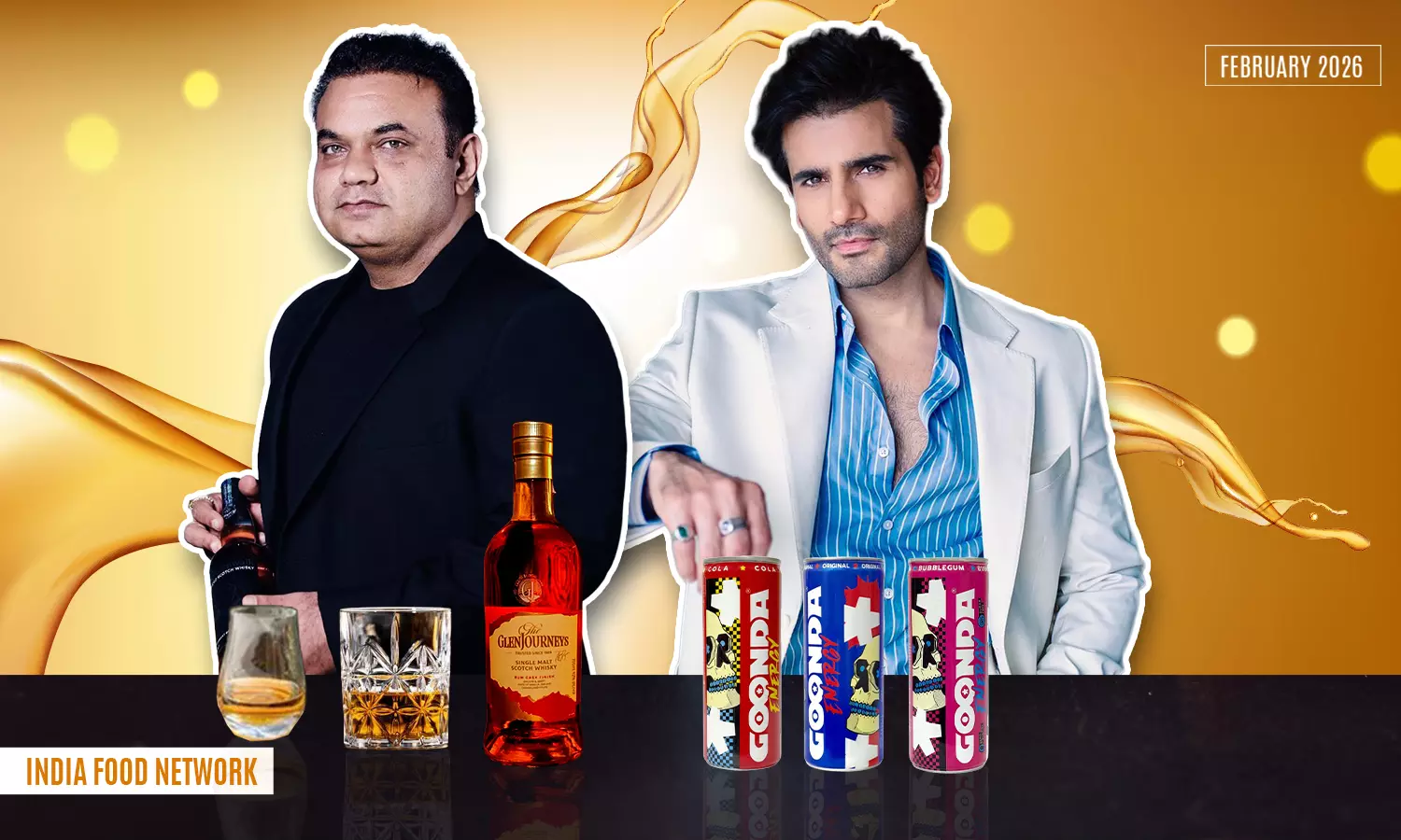
From bold graphics to sleek designs, food brands are turning packaging into a style statement. Karan Tacker and Mokksh Sani share how design and emotion shape Kitchen Couture.
- By Shreya MukherjeeLoading...
- | 7 Feb 2026 10:57 AM IST
 X
X
Once seen as a purely functional element (and as a way for us to spot the difference between two similar yet different brands), packaging has now become one of the strongest storytellers in the food and beverage industry. From commanding attention on crowded shelves to becoming social media-ready accessories, today’s packs are designed to be seen, shared, and remembered.
As the idea of “Kitchen Couture” gains popularity, brands are rethinking how their products look, feel, and live in everyday spaces. Packaging is no longer just about storing it out of our sight, in a dimly lit storage room. It is about personality, pride, and presence. It is about putting them on well-lit shelves to be admired and fit into the decor.
We speak to Karan Tacker of Goonda and Mokksh Sani, the visionary behind Living Liquidz, Mansionz, and Cartel Bros (The GlenJourneys with Ajay Devgn), on how they are dressing their brands to impress, balancing aesthetics with practicality, and building packaging that connects deeply with modern consumers.
Edited excerpts.
How big a role does packaging style play in making someone notice your product and buy it for the first time?
Karan: Packaging is the first point of contact. It sets the tone instantly. For GOONDA, the visual design was created to disrupt and not blend in. On crowded shelves and e-commerce platforms, it signals attitude and intent. The moment someone sees it, they understand it is a bold choice. That instant recognition is what helps turn curiosity into action.
Mokksh: Packaging plays a decisive role. It is often the first point of contact between the brand and the consumer, and in that moment, it communicates intent, quality, and credibility. Before the product is experienced, packaging sets expectations, which strongly influence the first purchase decision.
What look are you going for with your packaging this year, and how does it reflect your brand’s personality?
Karan: The look will always stay true to GOONDA’s core DNA, with a few new additions. Bold, expressive, and unapologetic. It reflects a brand built around energy, movement, and rebellion. The design feels street-forward yet considered, and mirrors the mindset of those who live outside the ordinary.
Mokksh: This year, The GlenJourneys is focused on a refined, contemporary aesthetic that speaks confidence and symbolises purposefulness. The design reflects our brand’s balance of modern luxury and exploration. It’s visually strong without being overstated, mirroring our belief that confidence doesn’t need excess.
What feeling do you want people to have the moment they pick up your product or open it?
Karan: It should feel energising. There should be a sense of anticipation. Picking it up should spark confidence and intent. Opening it should feel like the start of a moment. Focused, charged, and ready for what comes next. Undiluted emotion. Total immersion. Game on.
Mokksh: We want the experience to feel considered and intentional. The moment someone picks up the product, it should convey care, quality, and quiet excitement, an impression that what’s inside has been thoughtfully crafted and is worth slowing down for.
Do you design your packaging to be “show off” worthy for gifting, parties, or social media?
Karan: Yes. The packaging is designed to be seen. It holds its own in social settings and creates Instagram-ready moments that stop the scroll. Whether at parties or in everyday settings, the design invites sharing and conversation. It turns the product into a visual statement.
Mokksh: Yes, but with subtlety. The goal isn’t to design for spectacle, it’s to create something people are naturally proud to share. If the packaging feels elevated and distinctive enough to be gifted or displayed, that’s a reflection of its authenticity, not its flash.
How does the way your product lives in everyday spaces shape your packaging design?
Karan: GOONDA is designed to live where people gather, move, and celebrate. Homes, bars, parties, desks, and gyms. That reality drives every packaging decision.
The EL GOONDA spirit bottle is compact, square, and sturdy, inspired by bold Western agave spirits. Its flat silhouette sits comfortably on bar counters and house-party tables. The illustrated label, desert landscape, and skeletal character create a strong narrative. It feels rebellious yet crafted, premium yet approachable.
The GOONDA Energy can reflect the same attitude in a more versatile format. It is tall, slim, and easy to carry, with bold typography and graphics that demand attention. The Hipflask format offers ultimate portability for gym bags, long drives, and late nights. Across categories, the design remains functional, visually strong, and instantly recognisable.
Mokksh: Our packaging is designed to exist comfortably in real, everyday environments, with the bottle at the centre of that thinking. Its form is intentionally easy to hold, easy to pour, and durable enough for regular use, yet elegant enough to feel special. Whether it’s sitting on a home bar, travelling in a bag, or being opened during a celebration, the bottle is designed to transition seamlessly between the everyday and the occasion. It feels at home in daily rituals, but never out of place when the moment calls for something worth celebrating.
How do you balance trendy, studio-worthy designs with packaging that will still feel fresh a few years from now?
Karan: We focus on identity over trends. The design feels current without depending on short-term styles. It is built on a strong visual foundation that allows it to evolve naturally, while keeping the core brand philosophy intact.
Mokksh: Our focus always starts with strong fundamentals: typography, proportions, and material choices that ensure the design has lasting relevance. From there, we introduce just enough contemporary edge to keep it visually appealing and in line with current trends. A good example is our upcoming smoky expression, where the bottle is fully painted red, an unexpected, almost rebellious choice in a category traditionally dominated by darker, conservative tones. It challenges the conventional bottle design and sparks curiosity. After all, who would have imagined a single malt presented in a striking red bottle, and yet, it feels completely at home within our design language.
Beyond looks, what practical details matter most to you in your packaging?
Karan: Practicality begins with structure. The EL GOONDA bottle uses thick glass and a solid base for stability. Its compact form makes it easy to grip and pour, while durable labels and secure closures support frequent handling and travel.
The GOONDA Energy can is built for movement. Its slim, lightweight aluminium body handles condensation well and supports quick consumption. Across categories, every detail is intentional, functional, premium, and unmistakably GOONDA!
Mokksh: Beyond looks, practicality is built into every bottle's design. The 21-Year-Old Edition features a structured, elegant silhouette with refined detailing and a weighted feel, designed to signal maturity while remaining comfortable to hold and store. The Cask Series uses a bolder, more contemporary design language, with distinct finishes and clear labelling that highlight individuality and experimentation. Across both, elements like balanced proportions, secure closures, and durable materials ensure the packaging not only looks considered, but works effortlessly in everyday use and celebratory settings alike.
Looking ahead to 2026, how do you want your packaging to evolve to connect better with your audience?
Karan: In 2026, GOONDA’s packaging will stay true to its Indian roots, loud, proud, and polished for a global audience. We will amplify familiarity without dulling the edge.
Premium upgrades, such as embossed, high-grade paper labels, will elevate our top-shelf presence. The Hipflask will receive a sleeker, tougher refresh for spontaneous celebrations on the move. Our goal is to evolve alongside our audience and strengthen the tribe, not drift away from it.
Mokksh: By becoming more intentional and more human, we see our packaging evolving toward clearer storytelling, smarter material choices, and a stronger emotional connection, less noise, and more meaning. The aim is to create packaging that feels quietly confident and deeply aligned with our audience’s values.

Shreya Mukherjee
Shreya loves a good Harry Potter conversation when she is not busy figuring out the best toppings for Ramen. An avid reader who enjoys all forms of story-telling, you will find her either reading or binge-watching shows. She also loves spending her weekends taking care of her skin while figuring out which restaurant to get a take-out from.


